
How to Choose Exterior Paint Colors for Your Utah Home
Choosing the best exterior paint colors really comes down to a few key things: analyzing your home's permanent features like the roof and any stonework, considering the overall vibe of your neighborhood, and testing big paint samples in real daylight. Following this process helps ensure the final choice looks right, boosts your curb appeal, and truly feels like you.
Choosing Your Home's Perfect Exterior Palette
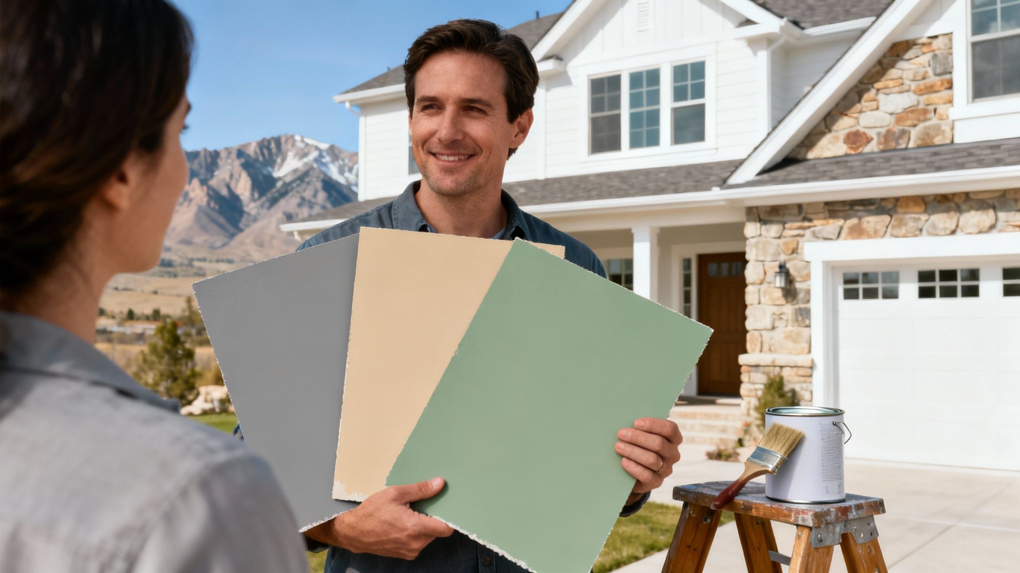
Picking an exterior paint color can feel like a massive commitment. After all, it's one of the most impactful decisions you'll make for your home's curb appeal and overall value. This isn't just about grabbing a color you like from the store; it's about creating a cohesive look that works with your home's architecture, your local environment, and even Utah's unique lighting.
We're going to walk you through a practical process, drawing on our years of experience helping homeowners in Orem, Provo, and beyond. We’ll show you how to go from feeling overwhelmed by endless paint chips to confidently selecting a palette that not only suits your style but also stands up to the elements.
This guide will help you see your home's exterior as a complete picture, so the final result is something you'll be proud of every time you pull into the driveway.
Boost Curb Appeal and Property Value
The right color choice is so much more than a simple cosmetic upgrade—it's a smart investment. Choosing wisely can seriously boost your home's curb appeal and even increase its resale value. Studies have shown that homes painted in appealing neutrals like soft grays, beiges, and off-whites can sell for up to 5-10% more than those with loud or dated colors.
Real estate experts have noticed that properties with earthy, neutral tones tend to sell faster in major U.S. markets compared to homes with vibrant reds or yellows. You can dig deeper into how exterior paint affects market trends in this detailed analysis of the global exterior paint market.
Pro Tip: A fresh coat of paint delivers one of the highest returns on investment of any home improvement project. It doesn't just modernize your home's look; it also acts as a crucial protective barrier against the elements, preventing expensive siding and trim repairs down the line.
The process below shows how a thoughtful paint choice can translate directly into real financial benefits.
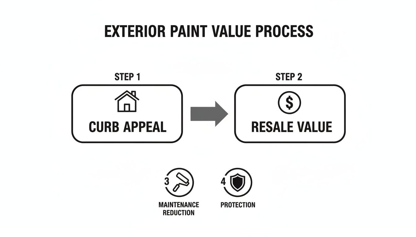
This visual draws a clear line from enhancing curb appeal straight to increasing resale value, which is a core benefit of a well-chosen exterior palette. A great paint job does more than just impress the neighbors—it builds equity. If you're looking for more smart home improvement ideas, check out our guide on how to increase property value.
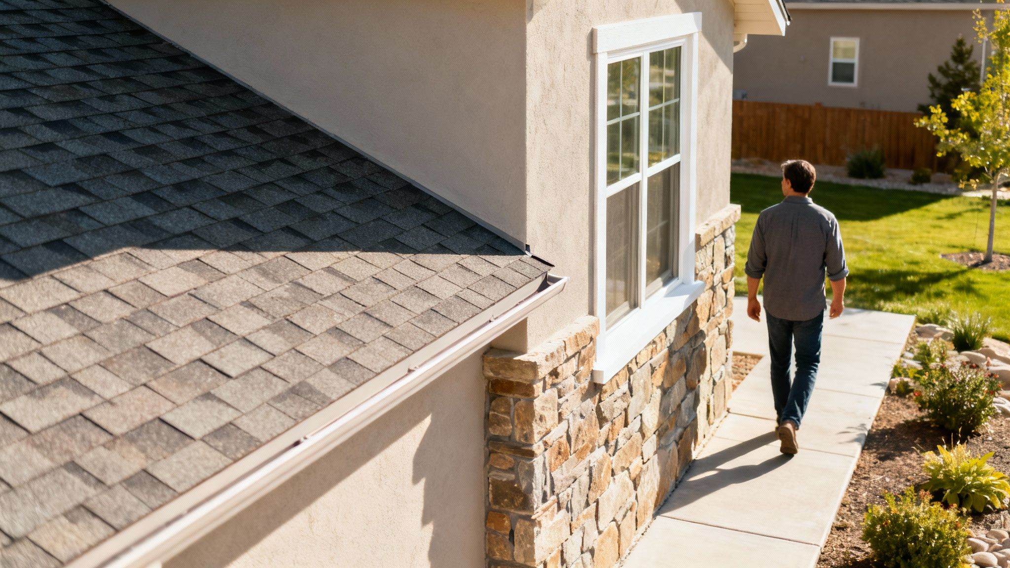
Take a Hard Look at Your Home’s Unchanging Features
Before you even think about picking up a paint chip, take a walk around your property. I mean, really look at it. The biggest mistake people make is choosing a color they love in isolation, without considering the parts of the house that aren't changing. The best color schemes work with these fixed elements, not against them.
Think of them as the non-negotiable parts of your palette. They're the foundation.
Start by looking up. Your roof is a massive block of color that you can't ignore. Is it a cool charcoal gray? A warm, reddish terracotta? Or maybe it's a mix of brown shingles. Get close and you'll probably see subtle undertones—little flecks of blue, green, or deep red. Those little specks are your first major clue for building a palette that feels unified.
Working With Stone and Brick
Next, move on to any stone or brickwork. These materials are loaded with color variations and really anchor the whole look of the house. I've seen it time and time again: a homeowner picks a body color that clashes with the brick's undertones, and the whole project feels off.
For instance, if you have classic orange-toned brick, a cool, modern gray siding is almost always going to look disconnected. It just feels wrong. A much better approach is to pull a color directly from the brick or mortar itself—a warm beige, a creamy off-white, or even a deep taupe. That's how you get that seamless, professionally designed look.
A home's fixed elements—the roof, stone, brick, and even pathways—are your built-in color palette. Listen to what they're telling you. Ignoring them is the fastest way to an exterior color scheme that just feels off.
Don't forget the smaller details, either. Things like your vinyl window frames, gutters, and downspouts play a big role. If they're a crisp, bright white, you can get away with a higher-contrast body color. But if they're beige or tan, you'll want to lean into warmer tones for your siding to avoid a jarring mismatch. If you find the windows are holding your design vision back, it might be worth exploring when to replace windows in your home to open up your options.
Look Beyond Your Property Line
Now, zoom out. Your house doesn't exist in a bubble. A fantastic color choice is one that feels like it belongs right where it is.
- Check Out the Neighborhood: Take a quick walk around the block. Is there a general vibe? You don't have to match your neighbors exactly—please don't!—but choosing a color that completely clashes with the entire street can make your home stick out in a bad way.
- Factor in the Landscape: The natural surroundings are a huge source of inspiration. Here in Utah, homes set against the dramatic backdrop of the Wasatch Front look incredible in earthy tones. Think deep greens, rich browns, and stony grays that mimic the mountainsides.
- Don't Forget the HOA: If you live in a planned community, always check the Homeowners Association's approved color list before you get your heart set on a specific shade. This one simple step can save you an unbelievable amount of time, money, and headaches.
The goal is to connect your home to its environment. It should feel grounded, thoughtful, and perfectly placed.
Choosing colors that fit your home's unique style can feel daunting, but it's easier when you have some starting points.
Pairing Palettes with Utah Architectural Styles
Here's a quick guide I've developed over the years to help homeowners in our area match palettes to some of the most common architectural styles we see across Utah.
| Craftsman / Bungalow | Earthy greens (sage, olive), deep reds, warm tans | Creamy off-white, dark brown, muted gold | Creating a cozy, natural feel that highlights woodwork. |
| Modern Farmhouse | Crisp white, charcoal gray, light beige | Black, natural wood tones, muted blues | Achieving high-contrast, clean lines and a fresh look. |
| Mountain Modern | Deep charcoal, warm grays, rich wood stains | Black, warm metals (bronze), stone-inspired tones | Blending the structure seamlessly with a rugged landscape. |
| Rambler / Ranch | Light grays, classic blues, warm off-whites | Bright white, deep navy, subtle greens | A timeless and versatile look for a classic home style. |
| Victorian / Historic | Historically accurate palettes (deep plums, forest greens) | Multiple complementary accent colors for intricate details | Restoring historic character and making details pop. |
This table is just a starting point, of course. The key is to use your home's unique architecture as a guide to narrow down the thousands of color choices into a palette that feels just right.
Crafting Your Perfect Palette with Color Theory
Once you’ve taken a good look at your home’s permanent features, it’s time for the creative part: building your color palette. Most professionally designed exteriors you admire probably follow a simple but powerful rule—the three-color scheme. This approach gives a home depth, character, and a polished, intentional feel.
Think of it like casting for a play. You have your star, a supporting actor, and a scene-stealer who makes a brief but memorable appearance.
- The Field Color: This is your leading role. It covers the largest surfaces, like your siding, and sets the overall mood.
- The Trim Color: This is the essential supporting actor. It highlights architectural details like window frames, fascia, and corner boards, outlining the home's structure.
- The Accent Color: This is your scene-stealer. Used sparingly on the front door, shutters, or gables, it’s that pop of personality that draws the eye.

This three-part structure is a classic for a reason. It creates visual interest without feeling busy or chaotic. The real magic, though, comes from using a bit of color theory to ensure all three parts work together beautifully.
Finding Your Color Scheme
You don't need to be an artist to get this right. The basic concepts are surprisingly simple and all come down to how colors interact on the color wheel. For exterior projects, a few time-tested schemes are almost always a win.
A monochromatic scheme is the definition of sophisticated and subtle. This approach uses different shades and tones of a single color. For instance, you could use a medium-light gray for the siding, a dark charcoal for the trim, and a nearly black shade for the accent. The result is an elegant, layered look that feels calm and unified. It’s nearly impossible to mess up.
Another fantastic choice is an analogous color scheme. This just means picking colors that sit side-by-side on the color wheel—like blue, blue-green, and green. This creates the kind of serene, cohesive feel you often see in nature. Imagine a home with soft sage green siding, trimmed in a deeper forest green, with a muted teal front door. It feels instantly peaceful and connected.
An exterior palette should tell a story. Whether it’s a calm, monochromatic narrative or a bolder, complementary one, the goal is to create a cohesive look that feels intentional and enhances your home’s best features.
If you’re craving a bit more drama, a complementary scheme can be absolutely stunning. This involves pairing colors from opposite sides of the color wheel, like blue and orange. This creates high-energy contrast, so the trick is to be subtle. You might see a deep navy blue house with warm, copper-toned light fixtures and a beautiful warm wood door. The key is letting one color dominate while its opposite serves as a sharp, deliberate accent.
A Real-World Example from Utah
Let’s ground this in a practical example we often see work beautifully right here in Utah. So many local homes feature stone or brick with warm, earthy undertones that blend perfectly with our natural landscape.
A go-to combination we’ve had great success with starts with an earthy greige (that perfect mix of gray and beige) for the field color. This shade partners wonderfully with the warm tones in local stone without clashing.
For the trim, a crisp but slightly warm off-white provides clean definition without the sterile feel of a pure, cool white. It frames the windows and roofline, making the architecture pop.
Finally, for that perfect accent, a welcoming deep green or a rich terracotta on the front door adds just the right amount of personality. This kind of palette feels grounded, sophisticated, and completely at home in a mountain environment. It’s a classic for a reason—it respects the home's unchangeable elements while creating undeniable curb appeal.
Picking a Paint That Can Handle Utah's Climate
Choosing the right color is only half the battle. If that beautiful shade is in the wrong type of paint, it just won't last. The paint formula itself—or even specialized exterior coatings—is what stands between your home and the harsh Utah elements.
Our climate is notoriously tough on exteriors. We've got intense high-altitude UV rays, bone-dry air, and wild temperature swings from summer to winter. You need a paint that's specifically designed to handle that kind of abuse. A great color in a cheap paint will crack, fade, and peel in just a few years, forcing you to do the whole job over again.
That's why, for homes anywhere from Orem to Provo, we almost always recommend a 100% acrylic latex paint. These modern formulas are true workhorses. They're engineered to be flexible, so when your siding expands in the July heat and shrinks in a January cold snap, the paint moves right along with it. This elasticity is what prevents the brittle cracking you see on older homes painted with inferior products.
Find the Right Sheen for Each Surface
The paint’s finish, or sheen, is about more than just looks—it’s a critical part of its performance. Different sheens are better suited for different parts of your home.
- Flat/Matte: This finish has zero shine, which is fantastic for hiding minor bumps and imperfections on older siding. The downside? Its porous texture can be tough to clean. It’s a great choice if you're going for a more rustic, low-sheen look on your main siding.
- Satin/Eggshell: This is our go-to for most residential siding. It offers a subtle, low luster that’s the perfect compromise between a forgiving finish and real-world durability. It’s far easier to wash down than a flat finish and does a better job resisting dirt and mildew.
- Semi-Gloss: With its noticeable shine, semi-gloss is built for durability and easy cleaning. We typically reserve this for high-traffic, high-impact areas like front doors, garage doors, and all of your window trim. These are the surfaces that take the most abuse.
For the best results, we often use a combination: a durable satin for the siding and a tough semi-gloss for the trim and accent details. This strategy gives every part of your exterior the specific protection it needs.
Don't Ignore the LRV Number
Ever notice that little number on the back of a paint chip called the Light Reflectance Value (LRV)? It’s one of the most important—and most overlooked—details when painting a house, especially in a sunny place like Utah.
LRV is measured on a scale from 0 (absolute black) to 100 (pure white) and tells you exactly how much light a color reflects.
A paint color's LRV isn't just about aesthetics; it directly impacts how much heat your house absorbs. Low LRV colors absorb heat, while high LRV colors reflect it. This can have real consequences for both your siding's lifespan and your energy bills.
Think about it: a dark charcoal siding with a low LRV can get incredibly hot under the summer sun, sometimes hot enough to cause vinyl or fiber cement siding to warp over time. That intense heat also accelerates the breakdown of the paint's binders, leading to faster fading and a much shorter lifespan for your paint job. We've seen dark colors need a repaint in 7 years instead of the typical 10.
In sunny areas like Lehi or Saratoga Springs, choosing a color with a higher LRV—like a soft white, a pale gray, or a cool blue—can actually help keep your house cooler by reflecting sunlight. It’s a simple choice that protects your investment. You’re not just picking a color; you’re choosing performance.
Never Trust the Tiny Paint Chip: Why Sampling Is Everything
Let me be blunt: If you choose your exterior paint color from a tiny paper swatch under the harsh fluorescent lights of a hardware store, you're setting yourself up for disappointment. This is, hands down, the most common and costly mistake I see homeowners and property managers make.
That little chip tells you almost nothing about how a color will actually look and feel on the side of your building. A color isn't a fixed thing; it's a chameleon. It changes dramatically with its surroundings. The bright morning sun, the deep afternoon shade, even the reflection from your neighbor’s red brick wall or the green grass below can pull out unexpected undertones.
The only way to know for sure is to test it in the real world.
This step isn't just a friendly suggestion—it’s the final, critical quality check between you and a mistake that could last a decade.
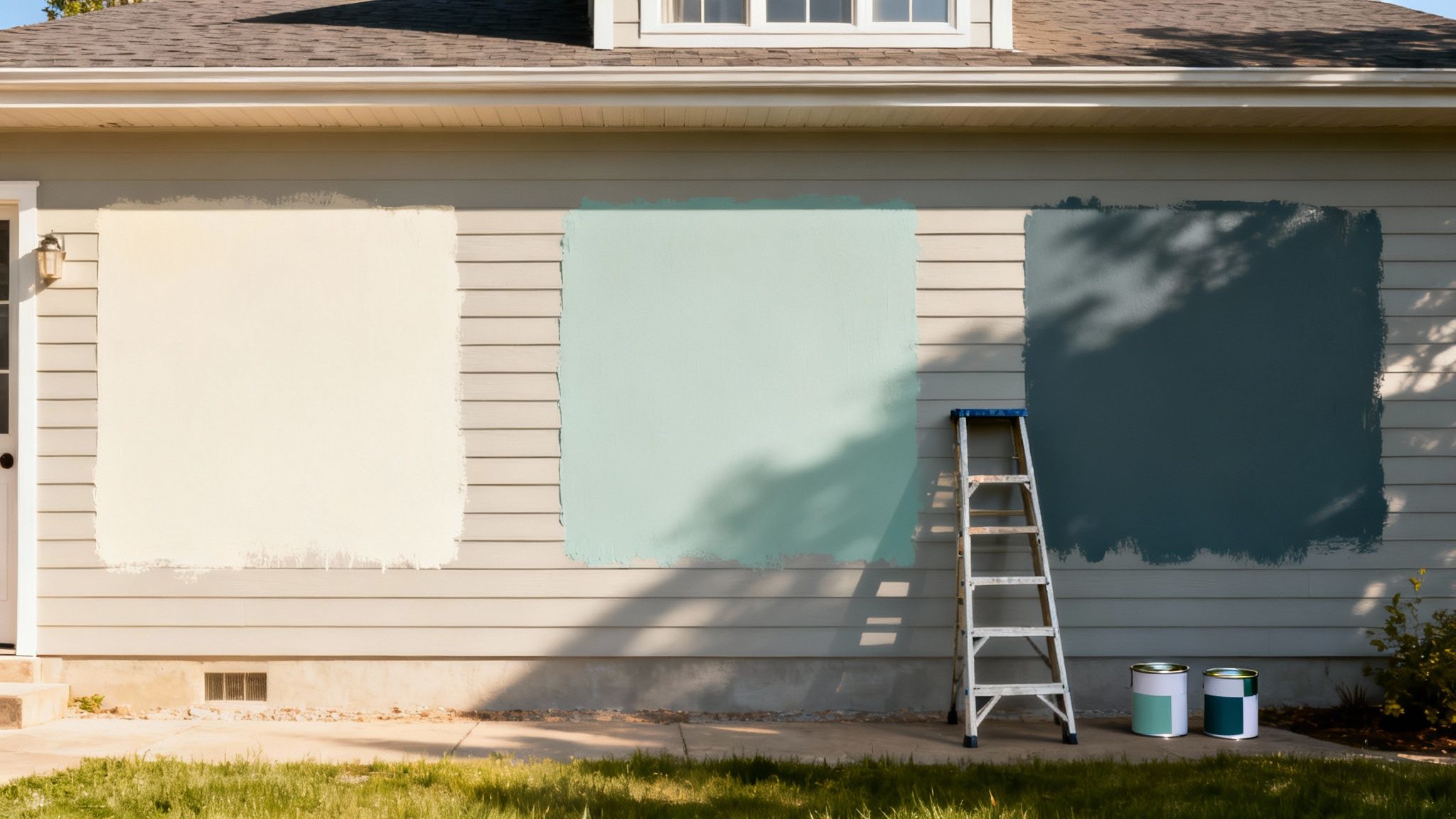
Go Big with Your Samples
To get a true feel for a color, you need to see it at scale. Tiny dabs of paint are just as misleading as the paper swatches. You want to see how the color behaves across a real surface, with real light and shadow.
Here’s how to do it right:
Buy Sample Pots: Once you’ve narrowed it down to your top two or three contenders, head to the store and buy a small sample pot of each. Don't balk at the cost—a few dollars now can save you thousands in repaint costs later.
Paint Large Swatches: Find a few different spots on your property and paint large test patches—think at least 3x3 feet each. Anything smaller just won't give you a true sense of the color's presence.
Place Them Strategically: Don't just paint one spot. Put one swatch on a wall that gets blasted with direct sun all day and another on a side that’s mostly in the shade. You might be shocked at how different the same color can look.
This method gives you the full picture, from the brightest midday glare to the cool shadows of the north-facing side.
Pro Tip: Never test a new color by painting it right next to your old paint. The current color will play tricks on your eyes and completely alter your perception of the new shade. Always paint your samples with a wide white border around them to see the color in isolation.
Live with Your Colors for a Few Days
Color is dynamic. It shifts and changes as the sun arcs across the sky. A color that looks perfectly warm and inviting at 10 AM might look dull and flat by 4 PM.
Give yourself time to observe the colors at different moments.
- Morning Light: How does it look in the crisp, cool light of early morning?
- Midday Sun: Check again when the sun is at its peak. This is when the color is at its most intense.
- Late Afternoon: Notice how the warm, golden light of late afternoon can bring out hidden undertones.
- Overcast Days: Don't forget to look on a cloudy day, when the light is gray and diffuse. This is often when a color’s true character comes out.
I’ve seen a beautiful greige turn alarmingly purple in the afternoon sun, much to the owner's horror. By living with your sample swatches for at least 48 hours, you give yourself the chance to catch these kinds of surprises. It might feel like a slow, tedious step, but it’s the single best way to avoid painter's remorse and ensure you’ll be happy with the result for years to come.
Partnering With Professionals for a Lasting Finish
You've spent a ton of time landing on the perfect exterior colors. That's a huge step, but the final quality of the job really comes down to execution. A professional paint job is more than just a cosmetic facelift; it's a serious investment in protecting your property and preserving its long-term value.
It can be tempting to jump on the lowest bid, but I've seen it time and again—that lowball quote almost always cuts corners on the single most vital part of the process: meticulous prep work.
The real secret to a paint job's longevity isn't in the final coat of color. It's forged in the hours spent pressure washing, scraping away old peeling paint, sanding rough spots, and applying a top-notch primer. These are the steps that guarantee the new paint will actually stick and stand up to years of sun, rain, and snow. A cheap quote almost always means they're skimping on this foundational work.
Vetting Your Painting Contractor
When you hire a pro, you’re handing over the keys to a major asset. It’s absolutely essential to do your homework to make sure you're getting a skilled, reputable, and insured team. Just knowing what to ask can mean the difference between a project that lasts a decade and one that’s peeling in two years.
Before you even think about signing a contract, make sure you cover these bases:
- Proof of Insurance: Don't be shy. Ask for current certificates of both liability and workers' compensation insurance. This is your shield against any liability if an accident happens on your property.
- Recent, Local References: A great contractor will be happy to share a list of recent clients. Actually call a few and ask about their experience. Were they professional? On time? How does the final product look?
- A Detailed, Written Contract: The contract needs to spell everything out. It should detail the exact scope of work, including specific prep tasks, the brand and type of paint to be used, the number of coats, and a clear payment schedule.
For a deeper dive into selecting the right partner for your project, our article on how to choose a general contractor offers additional valuable tips that apply here as well.
For Commercial and Rental Properties
If you're a commercial property manager or a landlord, the stakes are even higher. Your goal is a durable, attractive finish that keeps long-term maintenance costs down and tenants happy.
Sustainability and performance are key here. Eco-friendly, low-VOC paints now dominate the market in water-based acrylics, which is great news. For landlords, experience shows that neutral palettes can actually increase tenant retention. And in the world of vacation rentals, light, bright colors often boost the perception of cleanliness, which can directly correlate with higher nightly rates and better reviews.
Choosing a high-quality, long-lasting paint in a versatile neutral color is a strategic business decision. It reduces turnover costs, minimizes the frequency of repainting, and presents a clean, professional image that attracts and retains tenants.
Ultimately, teaming up with professionals is about much more than just slapping on some color; it’s about protecting your investment with a quality, durable finish. It doesn't hurt to understand their methods, either. For example, a detailed contractor's guide to using a paint spray gun airless system can give you a peek into the techniques the pros use to get that flawlessly smooth coverage.
Common Questions About Choosing Exterior Paint
When it comes to picking exterior paint colors, I find that homeowners and property managers often circle around the same few questions. It makes sense—you want to feel confident before you commit. Let's tackle some of the most common ones I hear.
How Long Will a New Paint Job Last Here in Utah?
You should expect a professionally done exterior paint job in Utah to last anywhere from 7 to 10 years. What makes it land on the higher or lower end of that range? It really boils down to three things: how well the surface was prepped, the quality of the paint you use, and how much sun and weather your building gets hit with.
Honestly, the single most critical factor is the prep work. You can use the best paint in the world, but if it's applied over a poorly prepared surface, it just won't last.
Do My Exterior Colors Need to Match My Interior?
Not at all. Think of your exterior and interior as two separate, but related, worlds. Your exterior colors should complement the things that aren't changing—your roof, any brick or stone, and the natural environment around your property. It’s all about curb appeal and fitting into the bigger picture of your street.
My Favorite Trick: If you do want to create a nice, subtle link between the inside and out, pick an accent color from your entryway decor and use it on your front door. It creates a seamless, welcoming transition without forcing your hand on the main house color.
What Exterior Paint Colors Are Popular Right Now?
Lately, it's all about sophisticated, nature-inspired colors. We're seeing a huge demand for warm off-whites, complex greiges (that perfect mix of gray and beige), and earthy sage greens. Classic, deep navy blues are also having a major moment.
A popular strategy is to go with a timeless neutral for the main siding. This gives you the freedom to get a little more creative with the front door, using a bolder accent color to make a statement and create a welcoming focal point.
Ready to give your property a beautiful, durable new look? The team at Northpoint Construction has been doing this for years, and we can help you navigate everything from picking colors to the final walkthrough. Get in touch for a consultation, and let’s start planning your project.